Why Design Needs Data
- Posted by Nicole Durbin
Any experienced UX designer will tell you: The best designs are grounded in research. We often rely on typical qualitative research methods like user interviews, contextual inquiry, and task-based testing to provide valuable insights. However, these methods do a poor job helping designers identify outliers, draw the line for MVP, and make choices when faced with conflicting anecdotal information. To fill this gap, data science can and should be used to supplement and validate qualitative insights. I recently worked with Fino’s data science department to do exactly that.
In web and product design, the 80/20 rule says that 20% of a product’s features will be used 80% of the time, which makes it crucial to nail the design of those features. As part of a major dashboard redesign for a large energy retailer, I used data to draw the 80/20 line and determine how to best display information on electric sales proposals.
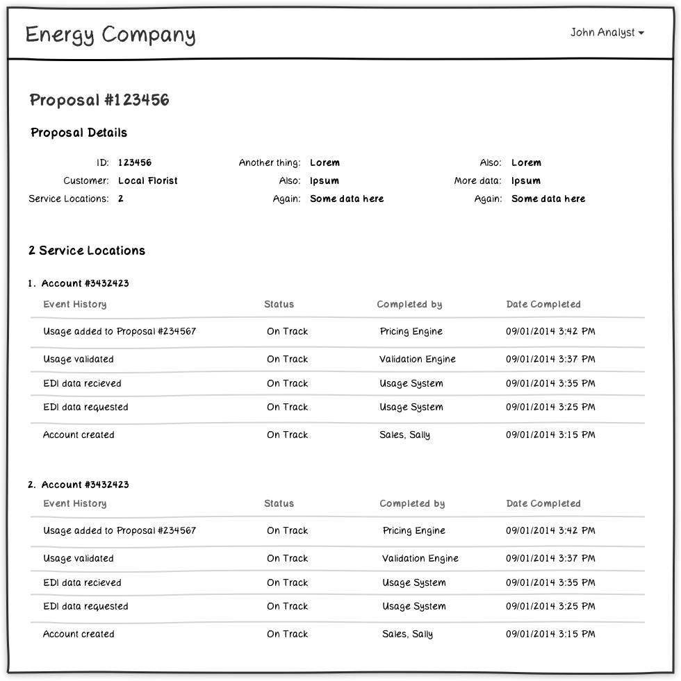
A quick explanation of terminology: An electric sales proposal can contain one or more service locations. If I’m selling electricity to my local florist, that proposal will contain only one service location, the florist’s address. If I’m selling electricity to, say, every Starbucks in New York City, that proposal would contain hundreds of service locations: the address of each over-roasted coffee abomination.
I knew from user interviews and contextual inquiry observations that both scenarios described above are realistic, but my qualitative research couldn’t tell me for sure which was more common and by what order of magnitude. And the difference between designing for a single service location versus a hundred or a thousand is significant. Should my designs be optimized for a proposal with hundreds of service locations or for proposals with just a few?
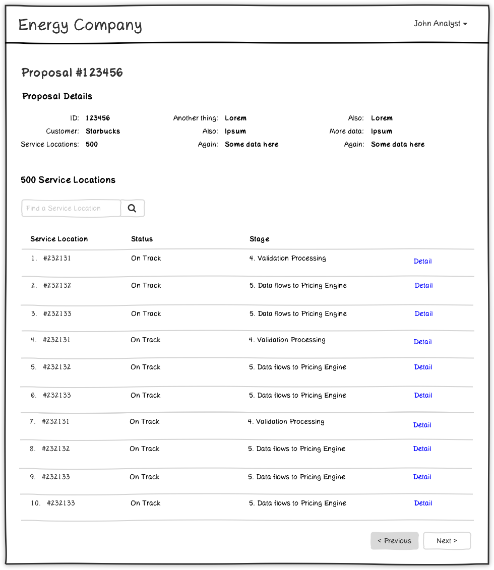
Layout optimized for many service locations:
Layout optimized for few service locations:
This is where Dr. Josh Ainsley, one of our data scientists here at Fino, comes in. I explained the question I was trying to answer, and Josh queried the energy company’s database of proposals and found this chart, which told me exactly what I needed to know. With this information, I learned that to optimize my designs for at least 80% of proposals, I should plan for a display of at least four service locations. If my designs could accommodate even eight service locations, I’d account for a whopping 90% of proposals!
With this in mind, I worked with Fino product management, client stakeholders, and future users of the product to optimize the proposal layout. We determined that the MVP for our initial release would accommodate viewing a detailed history for up to five service locations. Later releases will likely add features to optimize for a larger number of service locations, pagination, search, and more.
Without data, I never would have been able to make a confident decision about how many service locations to design for. Partnering with data science allowed me to ask a simple question and receive a completely unambiguous answer: a welcome rarity for a designer like me.
Tell us what you think @finoconsulting or by email.